According to Wikipedia…

If you didn’t know already, I’m a lover of eclectic information. Here is a sampling of some of the more interesting facts I’ve gleaned from the Wikipedia. In no particular order:

* Birds, reptiles and amphibians only have one orifice for their intestinal and urinary tract. This orifice is called the [Cloaca](http://en.wikipedia.org/wiki/Cloaca), from the Latin for sewer. If that’s not cool enough get this: some turtles have gills in their cloacal cavity.

* [Belt Drives](http://en.wikipedia.org/wiki/Belt_%28mechanical%29) are cool! Because of the repetitive nature of their use, wear is a major concern. Thankfully there are clever ways to reduce the wear. 1) flat belts can be made into a [Möbius strip](http://en.wikipedia.org/wiki/Möbius_strip). 2) timing belts can made so that the number of teeth on the belt and all of the sprokets are [coprime](http://en.wikipedia.org/wiki/Coprime).

* [Gastropoda](http://en.wikipedia.org/wiki/Gastropoda) have diversified so much over geological time that evolutionarily things have gotten very confused. There are land species with gills as well as marine species with lungs. Slugs (Gastropoda without much of a shell) are also interesting because most go through [torsion](http://en.wikipedia.org/wiki/Torsion_%28gastropod%29) where the internals and the shell of the gastropod rotate. This can be problematic since it puts the anus right by the mouth – but evolutionarily speaking it must of been helpful for something.

* The parasitic flatworm [Leucochloridium paradoxum](http://en.wikipedia.org/wiki/Leucochloridium_paradoxum) is an amazing example of [aggressive mimicry](http://en.wikipedia.org/wiki/Aggressive_mimicry). The flatworm’s sporocyst grows within a snail, invading the tentacles of the snail, with a preference to the left. The now swollen and colored tentacle mimics the appearance of a caterpillar – which a bird host eats. A snail then consumes the birds feces completing the cycle. Some interesting bits about the infected tentacle’s effect on the snail: 1) it cannot retract into its shell, leaving the flatworm always exposed. 2) it appears to reduce light sensitivity in the snail which keeps it out in the open in view of potential hosts.

* The [Tempest Prognosticator](http://en.wikipedia.org/wiki/Tempest_Prognosticator) was a curious invention from the 1850’s. It was a barometer made of [leeches](http://en.wikipedia.org/wiki/Leech). The inventor, George Merryweather, found that leeches would respond to changes in the atmosphere by climbing to higher ground. It consisted of a number of leaches each in their own glass jar, at the top of which was a piece of whale bone tied to a string. \[[diagram](http://www.scholars.nus.edu.sg/landow/victorian/technology/packer/merryweather.html)\] When the leach would climb the jar it would dislodge the whale bone which would pull a mallet which would strike a bell – you would guess the likelihood of a storm by the number of bell rings. He had lobbied for it to be distributed throughout the coast of England, but the British Crown decided instead on the (still not entirely understood) [storm glass](http://en.wikipedia.org/wiki/Storm_glass).

* [Neurocysticercosis](http://en.wikipedia.org/wiki/Neurocysticercosis) is a condition caused by the infestation of the brain by the tapeworm [Taenia solium](http://en.wikipedia.org/wiki/Taenia_solium). If you aren’t afraid of undercooked meat yet, I think you might now – the usual vector for infection is through larvae in pork meat (though autoinfection through vomit or feces is also possible). Treatment of Neurocysticercosis can be very problematic. The problem is that living cysticerci are typically asymptomatic, the complications arise when the organism dies, triggering the host’s immune response and leading to the inflammation, scarring, etc. that can lead to seizures, paralysis, and death.

* While all flies will occasionally mistake fetid wounds for dead flesh, [Cochliomyia hominivorax](http://en.wikipedia.org/wiki/Cochliomyia_hominivorax), a spechies of [screwworm fly](http://en.wikipedia.org/wiki/Screw_worm), is notable for targeting fresh wounds and even exposed skin (e.g. the navel) for laying their larvae, causing [Myiasis](http://en.wikipedia.org/wiki/Myiasis). The larvae are also very aggressive, if disturbed they will burrow further into the host, hence their name. They are known to infect humans and are also a major concern for [merino](http://en.wikipedia.org/wiki/Merino) sheep, where the condition is called flystrike. However, before you get too worried, know this – that the fly caused so much destruction to American cattle herds that the [sterile insect technique](http://en.wikipedia.org/wiki/Sterile_insect_technique) was developed as a means of controlling the screw worm. This led to its eradication in the United States in 1982.
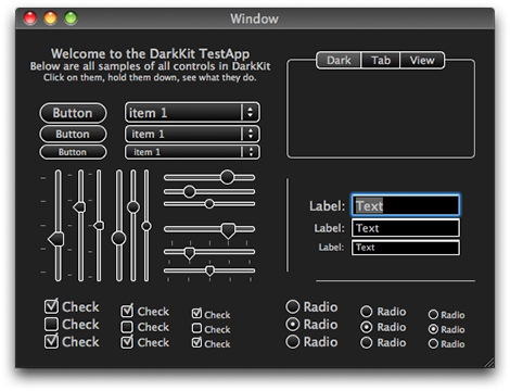
DarkKit


It’s been sitting in my ~/Projects folder for the better part of a year, but now it really is about time I [dust it off](http://blog.oofn.net/2008/05/07/the-developer’s-dilemma/) and set it free… finished or not.

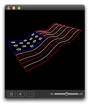
It started with my work on [LaserLine](http://www.acm.uiuc.edu/projects/LaserLine). I had written a parser for ILDA files, but needed a way to test its output. Naturally, I couldn’t accept Aqua’s presence in an app associated with an app for Lasers – which are all about bright lights and dark rooms. Granted, it was only two controls and some custom images, but by the time I was done there was no doubt in my or anybody else’s mind that the final app would be “dark”.

ILDA Inspector Animation

Knowing that a complete app would need a more complete library of widgets and subclassing AppKit seemed like a good way to get intimately acquainted with its internals, I didn’t stop there. A full accounting of my adventures in AppKit really deserves its own (lengthy) post that I’ll for later, I will just say this — kids, don’t try this at home. Even I, in my pixel perfecting, eye candy licking, gradient loving glory, will admit that the whole endeavor was likely not worth the time and frustration involved. But the work was done, so I might as well publish it.

Disclaimer: DarkKit is full of sketchy code. It began as a hack – and it still is a hack. It does a whole lot of things AppKit doesn’t want you do to; a whole lot of things you *shouldn’t* do. It uses private, undocumented methods and even shadier things (IIRC there was toying with a super’s instance variables somewhere). Keep this in mind if you think you might need help from AppKit folks – I doubt abusing their framework will endear them to you. *Use at your own risk*.

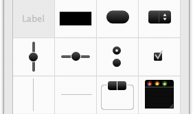
DarkKit Widgets

What does it cover? not everything, but hopefully enough to be kinda useful. Most of the controls have their dark alternatives and DKButton covers some of the button variants present in AppKit (the normal shiny capsule button, the square beveled button, and square gradient button). Where things get iffy are Views… NSScrollViews were not designed with alternative looks in mind (not that that’s a bad thing) and that causes problems when it comes to TableViews, etc.

Using DarkKit

If you’ve ever gone about working out in the dark, then you probably have a good appreciation for one of the reasons I decided DarkKit would be a nice thing to have. When everything around you is pitch black, the fluorescent glow of the computer’s screen stresses your eyes terribly, so much so that when I’d be typesetting text or some other project that extended way into the night I would regularly enable high-contrast mode (⌃⌥⌘8) to give my eyes a chance to relax. So, if you happen to be designing an application that is going to be used in low-light settings (a laser show for example) a good low-light interface approaches the point of being a requirement.

IMHO, a really dark interface also does an excellent job of placing content front-and-center. The huge contrast between your app’s monochrome controls and your app’s colorful/interesting content tells your eyes exactly what to look at and drastically reduces visual clutter.

So yea, if you happen to be doing a pro-thing (and you accept the disclaimer from earlier) DarkKit might be for you. And, if you hadn’t noticed yet, jet black interfaces seem to have a way of kicking an app’s sex appeal up a notch. So, if on the other hand you find yourself looking for cheap UI pixie dust DarkKit might also be helpful – not that I endorse pixie dust… just sayin’.

DarkKit IBPlugin

Seeing that doing something as damaging to you application’s stability, maintainability, and general code-quality as adding an illegitimate framework like DarkKit should only be done with the greatest care and after considered thought, I built a IBPlugin* so you can build all your dark interfaces with minimal effort right from interface builder. Enjoy!

*There was also a palette, back when that was cool…

» Continue on to [svn.oofn.net](http://svn.oofn.net)

Meanwhile…

Wisconsin Northwoods

I’m my past post I forgot to mention just how significant distraction can be to keeping projects from getting finished. Well, a bit ago I got Atmel’s [AT90USBKey](http://www.atmel.com/dyn/products/tools_card.asp?tool_id=3879) and last week, while up in a cabin in Wisconsin’s northwoods, I indulged my sentimental side and started reading Thoreau’s *Walden*. I’ll plan on getting back on the wagon, just not right now…

As Seen on Campus

Dumpster on Campus 'Capt. Hook'

Call (217) 352–9993. We’ll haul your Garrrrrbage…

The Developer’s Dilemma

People always like to quip that “real artists ship,” as a quick one-liner I guess that’s pretty good, but as with everything else… only sorta true. Anybody familiar with creativity has to admit that an end result of any quality usually requires a great deal of quantity in the background. Photographers will take hundreds of pictures in the process of producing tens of photos. Films emerge from hours worth of additional footage thrown in the waste bin. Graphic Designers build copious numbers of mockups to produce a final design.

We developers are in the idea business too and, although I feel wholly unqualified to say this, the *good* developers are the ones with lots of ideas. In my experience as a mediocre programmer I spend a lot of my time hounded by ideas of my own creation.

I found this great passage in an [article](http://www.dreamsongs.com/10ideas.html) by [Richard P. Gabriel](http://en.wikipedia.org/wiki/Richard_P._Gabriel):

John’s world is a world of ideas, a world in which ideas don’t belong to anyone, and when an idea is wrong, just the idea – not the person – is wrong. A world in which ideas are like young birds, and we catch them and proudly show them to our friends. The bird’s beauty and the hunter’s are distinct.

[…]

Some people won’t show you the birds they’ve caught until they are sure, certain, positive that they – the birds, or themselves – are gorgeous, or rare, or remarkable. When your mind can separate yourself from your bird, you will share it sooner, and the beauty of the bird will be sooner enjoyed. And what is a bird but for being enjoyed?

Every creative would love to claim a monopoly on divine inspiration, but since we can never quite manage that we settle for just hiding away all those half-finished, not quite thought-through, potentially embarrassing ideas of ours – and it’s a really nasty habit.

For developers, we have trouble kicking things out of out our ~/Projects folder and sharing them with others because they’re “just not done yet.” Doneness is a dangerous idea – especially for perfectionists. It is always so tempting to keep polishing this or that project until you can really say it is done. Or worse, putting something pretty good to the side and promising to come back to it later to finish it off.

I’ve without a doubt fallen into that trap, granted I’ll make an argument for school getting in the way, but the truth is I’ve been sitting on a whole lot of “not done yet” projects for no great reason at all. Now that I’m nearly out of school, with new-found time on my hands, I’m resolving to drag them out of the closet, give them the once-over and throw them out for others to have – done or not.

UIUC iCard [Free Design Advice]

I’ll start this post being blunt – I hate our new ID cards. I had been holding off for as long as I could, but with its swipe strip wearing through and the prospect of getting locked out of important places at inconvenient times, I decided to get proactive, suck it up, and trade my original card for the new and “improved” version.

There, that said, let’s begin. Last year the university began a transition to new ID cards. Starting in the fall 2007 semester all new cards issued are of the new type and the old cards will eventually be phased out completely sometime after 2009.

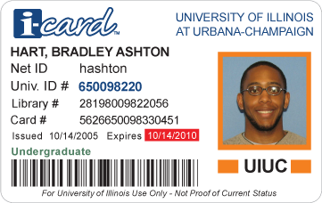
Pre 2007 ID Card

According to the [document](http://www.icard.uillinois.edu/dsp_new_icard.cfm) announcing the new design:

The i-card has a new look! After nearly 11 years without a major design change, the University of Illinois i-card is getting a facelift. The new card embodies both aesthetic and functional upgrades essential to the support of new card-based services. The new design represents several months of collaboration, consultation, and planning with multiple campus leaders. In addition, designs were approved by standing campus ID Committees and representatives from several campus units that provide card services.

With regard to the aesthetic and functional improvements, on the former they manage only by virtue of default and to the latter the card is an abject failure. Concerning the “several months of collaboration, consultation and planning…” well, on second thought let us not go there.

The purpose of an ID card is to present information and *absolutely* nothing else. Sure, it can look good, but it is not a fashion accessory. In this context the designer’s job is to convey information as effectively as possible, only working to make it pretty to the extent that it doesn’t detract from it’s effectiveness. it’s all about usability.

### Usability ###

In this application it’s very important to understand that not all information is equal. Some items are more important than others; I care about the person’s name more than I do their card’s number and so on. In order to account for this a good designer should make sure that useful information pops out at the user and other information fades into the background – the ways you do this are pretty standard, changing the text size, color, typeface, and/or position.

With that in mind lets see how effectively each version does its job. Here’s a list and subjective ranking of how apparent each bit of information is on the card:

Old Card New Card
Pre 2007 ID Card Post 2007 ID Card
  1. Name
  2. ID number
  3. Campus
  4. Expiration date
  5. Username
  6. Classification
  7. Library number
    Card number
  8. Issue date
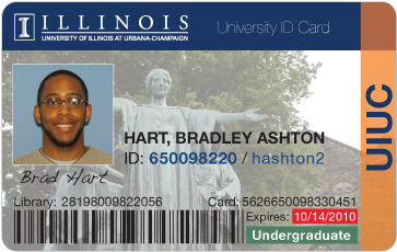
  1. Name
  2. Expiration date
  3. Classification
    ID number
    Library number
    Card number
  4. Campus

The number one thing that amazes me with this new card is that its designers managed to reduce the amount of information presented while, at the same time, reducing the usability of the remaining information. For any non-designers out there, just be aware that this is not how things are supposed to work. How did they manage this? THEY DESTROYED THE HIERARCHY.

Taking a look at the ranking for the old card design, it has a clear order that seems to correspond with what I would consider the relative importance of each morsel of information – name and number at the top and onto the library and card number (two seldom used items) at the bottom. On the other hand, for the new card the hierarchy formed only has half as many levels and I notice that half of the items of the new card fall into the 3rd stratum… uh oh.

The old card was designed smart… it was designed so that the very first number that appears to the searching eye was the most important – the university ID. In the “redesign” finding this number requires real, conscious effort. Where in the old it was set in a larger, bolder, unique color; in the new it is thrown into a big lump of useless information set in 10pt grey Arial – blech.

The very same thing could be said about the classification label. The label was a beautiful little piece of usability, where it could be color coded to the class of the card holder – along the lines of green for “Undergraduate”, orange for “Faculty”, etc., but now it too is dumped in with the always-grey text at the bottom. And I just don’t know what to make of the expiration text, with its bright-yellow color it is near if not possibly above cardholder name in noticeability.

### Appearance ###

Like I mentioned above… the claiming their design is an aesthetic improvement over the past really isn’t terribly impressive, it would be hard to argue that the original was even trying.

Post 2007 ID Card

First things first, why did the card get set entirely in Arial? I’m not one jump onto the Arial-Helvetica hatefest too readily, but I do ask that there be a good reason for using Arial over the original. Apart from the (distinct) possibility that this card was designed in MS Word I can’t think of one.

Next up is the gaping whitespace in the upper-right of the photograph. Huh? It is completely detracting and a bit unbalancing. In the physical version where the entire card is higher contrast (pre-press issues?) I will occasionally think a part of the card has gone missing.

And finally onto the business of this whole “i-card” thing. The cause of my university’s compulsion to brand everything will probably never be understood and I don’t feel like debating its premise… though it certainly is debatable (Email at UIUC is Express Mailâ„¢), but I would like question this i-card idea. 1, It does not add value – mentioning to my friends that I have an “i-card” does not impress them. 2, It does not aid identifiably – I don’t expect to get confused between this ID card or the zero (0) other university cards I have in my wallet. 3, The i-card logo is a ridiculous comic-sans-like handwriting that has no place in a formal document like this.

### What to Do ###

Since being a responsible critic means having a reasonable solution at the ready. And since a coping strategy of mine for living in this terribly designed world of ours is dwelling on “better” solutions, I went about designing a card of my own.

Proposed ID Card

I’ll spare you all the designing details (as this post has already gotten *very* long), but I would like to spend some time to justify the design. I’ll begin with the hierarchy. Front and center is are the 3 most important identifiers (excluding the picture) each of which are unique easily identifiable. Following is the expiry date and then the classification, coded with color for at-a-glance recognition. In the background are the library and card numbers, in small (but legible) type. Out of sight and to the side is and orange banner with the campus’s short name.

Except for the issue date, the design retains all the information of the old card. It returns the barcode and username that were removed in the revision. It also adds a printed signature field that was on the back of the original card (and curiously missing completely in the revision).

It also, IMHO, looks better than the previous designs too.

### Postscript ###

This is not to say that UIUC’s card is the worst of the bunch. The university ID card is an apparent backwater in the world of design. Below is a gallery of cards I collected as research:

ID Card Gallery

Out of the lot Wisconsin, MIT, and PennState came out with what I’d consider to be the best designs (and Chicago gets an honorable mention). But as a general rule they all either did pretty good in appearance (UCLA & Minnesota) but failed as far as usability went, or they failed in both respects. Eastern Illinois, without question, took last place. The beveled Gill Sans Ultra Bold “panther card” text is nauseating.

« Newer Entries
Older Entries »