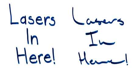
For those of you who may not now, my handwriting has a bit of a notorious reputation. A full explanation of how my writing came to be will have to wait for another day, but today I’m posting about the newly adopted writing style that I’ve began using on occasion.
So… getting more to the point – my handwritting, while it might look “goodâ€, it certainly cannot be construed as legible by any measure. Now this isn’t a problem for me in my normal writing (I’m the kind of person who is quite happy putting up with a few inconveniences for something of aesthetic value), but it does become an issue when you want people to notice *and* read your message – which was just the situation I found myself in a few days ago…
Thankfully I had spent the last week drawing sketches of type for typography class, so when it came time to post a few notes on the wall, I was quite prepared. For my nice clean, readable (and easy to draw) typeface I chose the fine typeface [Futura](http://en.wikipedia.org/wiki/Futura_%28typeface%29).
I still need to work on getting accustomed to the large counters in the ‘e’ and perfecting the curve of the ‘s’, I’m pretty proud of my new note posting script.
