I Shipped a Thing

Late last week a little app of mine made its way onto the App Store. So congratulations to me! but, uh, a minesweeper clone? that would *not* be very original. Nope, it’s not very original, but it is *better*.

It is my weak protest against the [garish](http://itunes.apple.com/us/app/minesweeper-*****/id407768156?mt=8) implementations that litter the App Store. It’s not something I’d plan to profit from (game development has always seemed to be an inevitably feral existence), but an argument for quality in the App Store, where barring a [few](http://carcassonneapp.com/) [exceptions](http://cocoastuff.com/products/deepgreen) it can seem like there is so little.

…It was also fun to do.

…How many times have I heard *that* said before?

DarkKit


It’s been sitting in my ~/Projects folder for the better part of a year, but now it really is about time I [dust it off](http://blog.oofn.net/2008/05/07/the-developer’s-dilemma/) and set it free… finished or not.

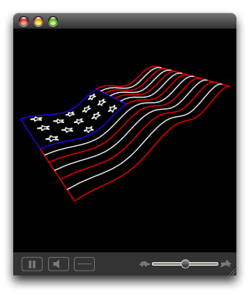
It started with my work on [LaserLine](http://www.acm.uiuc.edu/projects/LaserLine). I had written a parser for ILDA files, but needed a way to test its output. Naturally, I couldn’t accept Aqua’s presence in an app associated with an app for Lasers – which are all about bright lights and dark rooms. Granted, it was only two controls and some custom images, but by the time I was done there was no doubt in my or anybody else’s mind that the final app would be “dark”.

ILDA Inspector Animation

Knowing that a complete app would need a more complete library of widgets and subclassing AppKit seemed like a good way to get intimately acquainted with its internals, I didn’t stop there. A full accounting of my adventures in AppKit really deserves its own (lengthy) post that I’ll for later, I will just say this — kids, don’t try this at home. Even I, in my pixel perfecting, eye candy licking, gradient loving glory, will admit that the whole endeavor was likely not worth the time and frustration involved. But the work was done, so I might as well publish it.

Disclaimer: DarkKit is full of sketchy code. It began as a hack – and it still is a hack. It does a whole lot of things AppKit doesn’t want you do to; a whole lot of things you *shouldn’t* do. It uses private, undocumented methods and even shadier things (IIRC there was toying with a super’s instance variables somewhere). Keep this in mind if you think you might need help from AppKit folks – I doubt abusing their framework will endear them to you. *Use at your own risk*.

DarkKit Widgets

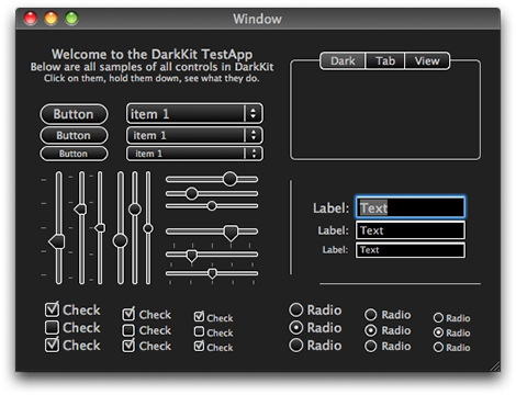
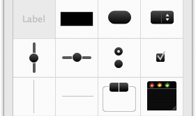
What does it cover? not everything, but hopefully enough to be kinda useful. Most of the controls have their dark alternatives and DKButton covers some of the button variants present in AppKit (the normal shiny capsule button, the square beveled button, and square gradient button). Where things get iffy are Views… NSScrollViews were not designed with alternative looks in mind (not that that’s a bad thing) and that causes problems when it comes to TableViews, etc.

Using DarkKit

If you’ve ever gone about working out in the dark, then you probably have a good appreciation for one of the reasons I decided DarkKit would be a nice thing to have. When everything around you is pitch black, the fluorescent glow of the computer’s screen stresses your eyes terribly, so much so that when I’d be typesetting text or some other project that extended way into the night I would regularly enable high-contrast mode (⌃⌥⌘8) to give my eyes a chance to relax. So, if you happen to be designing an application that is going to be used in low-light settings (a laser show for example) a good low-light interface approaches the point of being a requirement.

IMHO, a really dark interface also does an excellent job of placing content front-and-center. The huge contrast between your app’s monochrome controls and your app’s colorful/interesting content tells your eyes exactly what to look at and drastically reduces visual clutter.

So yea, if you happen to be doing a pro-thing (and you accept the disclaimer from earlier) DarkKit might be for you. And, if you hadn’t noticed yet, jet black interfaces seem to have a way of kicking an app’s sex appeal up a notch. So, if on the other hand you find yourself looking for cheap UI pixie dust DarkKit might also be helpful – not that I endorse pixie dust… just sayin’.

DarkKit IBPlugin

Seeing that doing something as damaging to you application’s stability, maintainability, and general code-quality as adding an illegitimate framework like DarkKit should only be done with the greatest care and after considered thought, I built a IBPlugin* so you can build all your dark interfaces with minimal effort right from interface builder. Enjoy!

*There was also a palette, back when that was cool…

» Continue on to [svn.oofn.net](http://svn.oofn.net)

Port Your iChats folder to 10.5

Just today I noticed that in 10.5 iChat started to organize the chat transcripts held in ~/Documents/iChats/. Here is a script you can use to organize all of your pre 10.5 chats in the new iChat v4 places:

#!/bin/bash                                            
DIR="${HOME}/Documents/iChats"

for I in $DIR/*.ichat
do
    if [ ! -e "$I" ]
    then
        break
    fi

    D=$I
    D=${D##*on }
    D=${D%% at*}

    if [ ! -d "$DIR/$D" ]
    then
        mkdir "$DIR/$D"
    fi
    mv "$I" "$DIR/$D/"

    echo ${I#$DIR/}
done

echo "FINISHED"

And if you’re always changing IPs this can be handy:

find ./ -name "*AOL System Msg*" -print0 | xargs -0 rm

As Seen at WWDC

A gigantic [Papier-mâché](http://en.wikipedia.org/wiki/Papier_mâché) [BNC Connector](http://en.wikipedia.org/wiki/BNC_connector) near the Marina. I have no idea from whence it came or what on earth it could conceivably be used for.

And before you ask – no, I did not find the [female](http://en.wikipedia.org/wiki/Female_connector) connector.

It’s all about the Brackets, Baby!

Obj-C hands picture

With [C4\[1\]](http://rentzsch.com/c4/1preNotes) starting tomorrow (which I, sadly, won’t be at). It seems apropos that I put out my graphical rendering of Rentzsch’s Obj-C sign from C4[0]. There you are!

(more…)

Helvetica.

Helvetica book side 1
Wednesday evening [Joey](http://joeyhagedorn.com) and I left [WWDC](http://developer.apple.com/wwdc/) for a bit and attended a screening for [*Helvetica*](http://www.helveticafilm.com/). A film that as the director, Gary Hustwit, says is “a movie about a font”*. The screening was at hosted by the San Francisco [AIGA](http://www.aiga.org/) for their [Design Week](http://www.aigasf.org/events/event_designweek07.html), and it was excellent.

For those of you who don’t yet know, [Helvetica](http://en.wikipedia.org/wiki/Helvetica) is “among the most widely used sans-serif typefaces internationally”[1](http://en.wikipedia.org/wiki/Helvetica#Usage) and this year (2007) happens to be its [50th anniversary](http://news.bbc.co.uk/1/hi/magazine/6638423.stm). Over those fifty years it has been in the wordmarks of an uncountable number of
[c](http://www.aa.com/)[o](http://americanapparel.net/)[r](http://www.jeep.com/)[p](http://www.lufthansa.de/)[o](http://www.microsoft.com/)[r](http://www.energizer.com/)[a](http://www.nationalcar.com/)[t](http://www.panasonic.com/)[i](http://www.toyota.co.jp/)[o](http://www.target.com/)[n](http://www.thenorthface.com/)[s](http://www.bmw.com/) and has developed quite an reputation both good and bad among graphic designers the world over.

And yes, Helvetica is also the default font for much of OS X.

Helvetica book side 2
The film is a meditation on Helvetica and the impact it has had on design over its 50 years. It has interviews with a number of designers from the US and Europe, including a brief appearance by Hermann Zapf. Interspersed throughout were cuts of Helvetica sightings, on busses, bathrooms, mail bags, billboards, etc. that emphasize its overwhelming, yet unnoticed, ubiquity.**

The designers in the movie all had strong feelings about this notorious typeface and each of the had some choice quotes- like those next to this post (which are covers to a cool [notebook](http://www.veer.com/products/merchdetail.aspx?image=VPR0002068) by Veer).

Most criticism took on Helvetica’s complicity in supporting “god-awful conformity”. Naturally, in my own nihilistic way, I choose to accept it for what it is, a finely crafted and very popular san-serif typeface. And to direct my criticisms of modernism to the school of thought, not its instrument of design.

I hear that the DVD will be released later this year in October- I’m waiting anxiously for it and you should too!

* Helvetica is [not](http://www.aiga.org/content.cfm/theyre-not-fonts) really a font, but rather a typeface.

** While Helvetica type is everywhere, it takes some [skill](http://www.ms-studio.com/articlesarialsid.html) to distinguish between it and its brethren.

Next Page »
Older Entries »