I’ll start this post being blunt – I hate our new ID cards. I had been holding off for as long as I could, but with its swipe strip wearing through and the prospect of getting locked out of important places at inconvenient times, I decided to get proactive, suck it up, and trade my original card for the new and “improved†version.
There, that said, let’s begin. Last year the university began a transition to new ID cards. Starting in the fall 2007 semester all new cards issued are of the new type and the old cards will eventually be phased out completely sometime after 2009.
According to the [document](http://www.icard.uillinois.edu/dsp_new_icard.cfm) announcing the new design:
The i-card has a new look! After nearly 11 years without a major design change, the University of Illinois i-card is getting a facelift. The new card embodies both aesthetic and functional upgrades essential to the support of new card-based services. The new design represents several months of collaboration, consultation, and planning with multiple campus leaders. In addition, designs were approved by standing campus ID Committees and representatives from several campus units that provide card services.
With regard to the aesthetic and functional improvements, on the former they manage only by virtue of default and to the latter the card is an abject failure. Concerning the “several months of collaboration, consultation and planning…†well, on second thought let us not go there.
The purpose of an ID card is to present information and *absolutely* nothing else. Sure, it can look good, but it is not a fashion accessory. In this context the designer’s job is to convey information as effectively as possible, only working to make it pretty to the extent that it doesn’t detract from it’s effectiveness. it’s all about usability.
### Usability ###
In this application it’s very important to understand that not all information is equal. Some items are more important than others; I care about the person’s name more than I do their card’s number and so on. In order to account for this a good designer should make sure that useful information pops out at the user and other information fades into the background – the ways you do this are pretty standard, changing the text size, color, typeface, and/or position.
With that in mind lets see how effectively each version does its job. Here’s a list and subjective ranking of how apparent each bit of information is on the card:
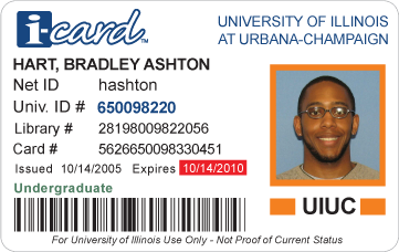
| Old Card |
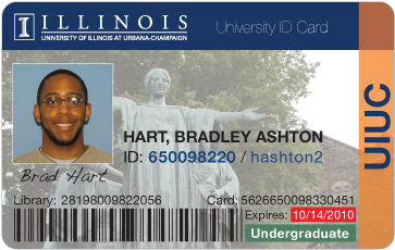
New Card |
 |
 |
- Name
- ID number
- Campus
- Expiration date
- Username
- Classification
- Library number
Card number
- Issue date
|
- Name
- Expiration date
- Classification
ID number
Library number
Card number
- Campus
|
The number one thing that amazes me with this new card is that its designers managed to reduce the amount of information presented while, at the same time, reducing the usability of the remaining information. For any non-designers out there, just be aware that this is not how things are supposed to work. How did they manage this? THEY DESTROYED THE HIERARCHY.
Taking a look at the ranking for the old card design, it has a clear order that seems to correspond with what I would consider the relative importance of each morsel of information – name and number at the top and onto the library and card number (two seldom used items) at the bottom. On the other hand, for the new card the hierarchy formed only has half as many levels and I notice that half of the items of the new card fall into the 3rd stratum… uh oh.
The old card was designed smart… it was designed so that the very first number that appears to the searching eye was the most important – the university ID. In the “redesign†finding this number requires real, conscious effort. Where in the old it was set in a larger, bolder, unique color; in the new it is thrown into a big lump of useless information set in 10pt grey Arial – blech.
The very same thing could be said about the classification label. The label was a beautiful little piece of usability, where it could be color coded to the class of the card holder – along the lines of green for “Undergraduateâ€, orange for “Facultyâ€, etc., but now it too is dumped in with the always-grey text at the bottom. And I just don’t know what to make of the expiration text, with its bright-yellow color it is near if not possibly above cardholder name in noticeability.
### Appearance ###
Like I mentioned above… the claiming their design is an aesthetic improvement over the past really isn’t terribly impressive, it would be hard to argue that the original was even trying.

First things first, why did the card get set entirely in Arial? I’m not one jump onto the Arial-Helvetica hatefest too readily, but I do ask that there be a good reason for using Arial over the original. Apart from the (distinct) possibility that this card was designed in MS Word I can’t think of one.
Next up is the gaping whitespace in the upper-right of the photograph. Huh? It is completely detracting and a bit unbalancing. In the physical version where the entire card is higher contrast (pre-press issues?) I will occasionally think a part of the card has gone missing.
And finally onto the business of this whole “i-card†thing. The cause of my university’s compulsion to brand everything will probably never be understood and I don’t feel like debating its premise… though it certainly is debatable (Email at UIUC is Express Mailâ„¢), but I would like question this i-card idea. 1, It does not add value – mentioning to my friends that I have an “i-card†does not impress them. 2, It does not aid identifiably – I don’t expect to get confused between this ID card or the zero (0) other university cards I have in my wallet. 3, The i-card logo is a ridiculous comic-sans-like handwriting that has no place in a formal document like this.
### What to Do ###
Since being a responsible critic means having a reasonable solution at the ready. And since a coping strategy of mine for living in this terribly designed world of ours is dwelling on “better†solutions, I went about designing a card of my own.
I’ll spare you all the designing details (as this post has already gotten *very* long), but I would like to spend some time to justify the design. I’ll begin with the hierarchy. Front and center is are the 3 most important identifiers (excluding the picture) each of which are unique easily identifiable. Following is the expiry date and then the classification, coded with color for at-a-glance recognition. In the background are the library and card numbers, in small (but legible) type. Out of sight and to the side is and orange banner with the campus’s short name.
Except for the issue date, the design retains all the information of the old card. It returns the barcode and username that were removed in the revision. It also adds a printed signature field that was on the back of the original card (and curiously missing completely in the revision).
It also, IMHO, looks better than the previous designs too.
### Postscript ###
This is not to say that UIUC’s card is the worst of the bunch. The university ID card is an apparent backwater in the world of design. Below is a gallery of cards I collected as research:
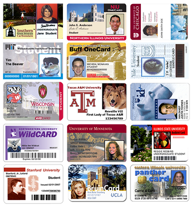
Out of the lot Wisconsin, MIT, and PennState came out with what I’d consider to be the best designs (and Chicago gets an honorable mention). But as a general rule they all either did pretty good in appearance (UCLA & Minnesota) but failed as far as usability went, or they failed in both respects. Eastern Illinois, without question, took last place. The beveled Gill Sans Ultra Bold “panther card†text is nauseating.


